The Psychology of Palette: Framing Room Moods Through Abstract Art
- Elisa Gomez
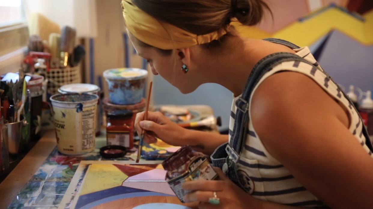
- Jul 14
- 5 min read

When designing a space, we often think of abstract art as the final layer—a finishing touch brought in to pull a room together. But when you look at abstract work through the lens of color psychology, a large-scale canvas or site-specific mural becomes much more than decoration. It becomes the emotional anchor of the entire room.
Because abstract art relies on form, texture, and color rather than a literal subject, its palette dictates how a space feels.
By aligning the color palette of a piece with the functional purpose of a room, you can intentionally shape the human experience within it.
Here are a few examples of how different color palette moods can be strategically deployed across distinct spaces to elevate both residential and commercial design.
These are all suggestions based on the psychology of color, however, and we all know rules were meant to be broken. So, if you find yourself in love with a different color scheme for a room that is suggested otherwise below, go for it. Go with your gut!
The Scale Factor: Canvas vs. Mural
While color dictates the emotional frequency of a room, scale dictates its volume. The physical footprint of an abstract piece determines how much a viewer interacts with the surrounding architecture versus how much they are pulled into the world of the artwork itself.
Choosing between a framed, large-scale canvas and a site-specific mural fundamentally shifts how a color palette behaves within a space.
Large-Scale Canvases (The Intentional Anchor): A large-scale canvas (e.g., a 5x6 foot mixed-media painting) operates as an intentional focal point. Because it is contained by its edges or a frame, it exists in dialogue with the wall it hangs on. It creates a sense of curated focus. The viewer approaches a canvas as a distinct object, allowing them to step back, appreciate the composition, and process the colors within a defined boundary.
Site-Specific Murals (The Immersive Environment): When abstract art transitions into a site-specific mural, the boundaries of the architecture completely dissolve. The artwork is no longer on the wall; it is the wall. Murals create an enveloping, immersive experience. Because the palette wraps around the physical space, it forces a shift in perspective. If a canvas is a window, a mural is the landscape itself, taking a massive architectural scale and humanizing it.
1. Grounded Earth Tones: Terracotta, Walnut, and Sand
The Mood: Calming, tactile, stabilizing, and deeply organic.
Best Suited For: Living rooms, entryways, and collaborative workspaces.
Earth-minded palettes bridge the gap between the built environment and the natural world. When an abstract piece utilizes rich, warm ochres, deep terracottas, and soft sand tones, it instantly lowers the collective heart rate of a room.
In a Space: In a residential living room or a welcoming commercial lobby, an earth-toned abstract piece acts as a stabilizing force. It pairs beautifully with natural materials like warm walnut cabinetry, camel leather, and raw architectural textures.
Deploying Scale:
The Mural Approach: A site-specific mural is incredibly effective in a commercial lobby or a long entryway using this palette. Sweeping, organic arches or soft color fields in sand and terracotta can transform a sterile, hard-angled drywall corridor into an expansive, canyon-like transitional experience.
The Canvas Approach: In a residential living room, a large-scale mixed-media canvas allows the palette to feel balanced and curated. Hung above a walnut sideboard or a low-profile sofa, it creates a warm focal point that anchors the furniture arrangement without engulfing the room.

Natura Chaos II virtual install in warm toned living room
2. High-Contrast Energy: Deep Burgundy, Charcoal, and Crisp White
The Mood: Dramatic, sophisticated, emotionally evocative, and focused.
Best Suited For: Dining rooms, executive boardrooms, and creative studios.
When you want a space to command attention and stimulate conversation, high-contrast palettes deliver. The interplay between deep, brooding tones and stark highlights creates an active visual rhythm.
In a Space: A dining room or an upscale meeting space thrives on this kind of atmosphere. A palette featuring a rich, velvety burgundy balanced by deep charcoal and crisp, intentional negative space creates a sophisticated backdrop that feels both intimate and grand.
Deploying Scale:
The Canvas Approach: This high-intensity mood is often best served by a large-scale canvas. Because deep burgundy and heavy charcoal carry immense visual weight, containing them within a massive, single frame forces the dramatic energy into a sharp, powerful focal point. It becomes an elegant conversation piece centered on a wall, acting as a dynamic emotional statement.
The Mural Approach: Reserve a mural for a single feature wall in a creative workspace or an avant-garde dining venue. Focus the high-contrast elements around architectural transitions—like letting deep charcoal strokes wrap around a corner or frame a doorway—to give the stark palette a sense of structural purpose.

3. Cool Restorative Tones: Muted Sage, Slate, and Soft Blues
The Mood: Restorative, expansive, intellectual, and serene.
Best Suited For: Bedrooms, wellness spaces, and private offices.
Cool colors naturally recede visually, making walls feel more expansive and giving the mind room to breathe. When kept muted or desaturated, these tones promote deep focus and psychological rest.
In a Space: For environments dedicated to rest or high-focus solitary work, loud art can feel like visual noise. A cool, quiet palette establishes an atmosphere of clarity and decompression.
Deploying Scale:
The Mural Approach: Because cool tones recede, an abstract mural in sage or slate can visually expand a small or enclosed wellness space. By letting soft, fluid gradients wash across entire walls without the boundary of a frame, the physical walls seem to melt away, creating a deeply immersive, spa-like environment of mental stillness.
The Canvas Approach: In a private office or bedroom, a large color-field canvas provides a restful place for the eyes to land. Position it directly across from a desk or seating area; it acts as a quiet, intellectual window, allowing the viewer to gaze into the layered, soft blues and hit a psychological reset button during a busy day.

Design Tip: Don't just match the dominant color of the art to the walls. Look for an abstract piece where the accent notes or undertones pull from the room’s textures—like a flash of brass, a hint of raw canvas, or a stroke that mirrors the grain of the furniture. This creates a layered, intentional dialogue between the architecture and the art.
Ultimately, integrating abstract art into a space is not about finding a piece that simply matches the decor; it is about initiating an intentional dialogue between the artwork and the architecture itself. By thoughtfully pairing the psychological frequency of a color palette with the spatial volume of its scale—whether through the curated focus of a large-scale canvas or the enveloping embrace of a site-specific mural—art ceases to be a passive bystander on a wall. Instead, it becomes a structural tool that actively shapes the human experience within an environment, defining not just how a room looks, but how it feels to live and work inside it.
To get notified of new blogs and newsletter updates, sign up on my website here!


Comments