How to Choose Abstract Art for a Small Space: Scale, Color, and Why Going Big Often Works Better.
- Elisa Gomez
- 14 hours ago
- 10 min read

One large abstract painting almost always outperforms a gallery wall in a small room. Here's how to choose it.
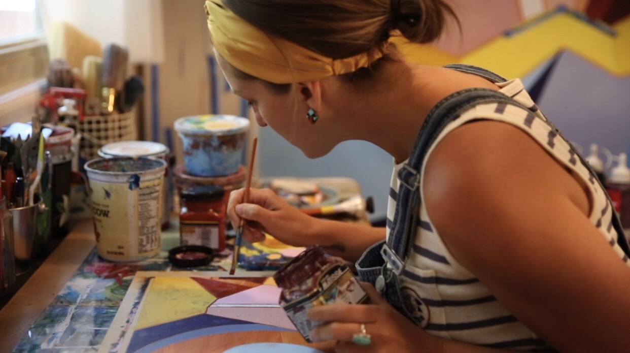
I understand the instinct to scale down art in a small room. The room is compact, the walls feel limited, and the fear of getting it wrong is real. But as a painter whose large-format works hang in compact urban apartments and smaller suburban homes, I can tell you that instinct is often wrong.
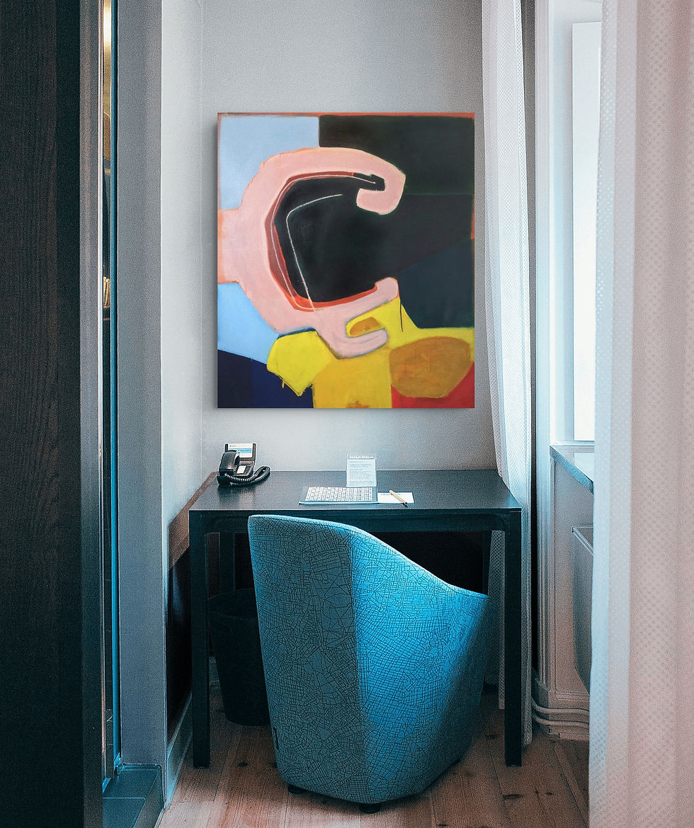
One large abstract painting almost always outperforms a gallery wall of smaller pieces in a tight space. A single work gives the eye one place to land, anchors the room, and signals purpose. Multiple small frames fragment the viewer's attention, crowd the wall, and draw attention to how little space exists rather than away from it.
The right large abstract painting does not fill a small room. It resolves it.
My hope is that by the end of this guide, you will know exactly how to:
Measure a wall and determine the right painting size
Read the light, orientation, and existing palette before choosing a color
Understand why one statement piece outperforms a gallery wall in compact spaces
Find large-format originals that live well in residential rooms
Why Large Abstract Art Works in Small Spaces.
Most people assume a small room calls for small art. Professional designers and painters know the opposite is usually true. The logic is spatial, not stylistic.
1. A single focal point calms the room
When one large painting anchors a wall, the eye has a destination. It lands, rests, and moves on to the rest of the room. Multiple small frames create a stop-and-go rhythm that creates a feeling of business rather than settling. As painter Christine Olmstead puts it: "In smaller rooms, one substantial piece avoids the stop-start effect of many small objects and gives the wall a calmer visual rhythm."
2. Large format pulls the eye upward
A painting with vertical movement, or a composition that extends toward the upper portion of the canvas, draws the gaze upward, making ceilings feel higher than they are. This is one of the most effective visual tricks available in a compact room, and it costs nothing beyond choosing the right work.
3. Breathing room signals confidence
A single painting with open wall space around it reads as deliberate. A tight cluster of small frames emphasizes the wall's limitations. Emily Jeffords describes large-scale art as something that "anchors the room and directs the eye, helping a compact space feel organized rather than crowded." That organization is what makes a small room feel resolved rather than stuffed.
4. Scale is relative to the wall, not the room
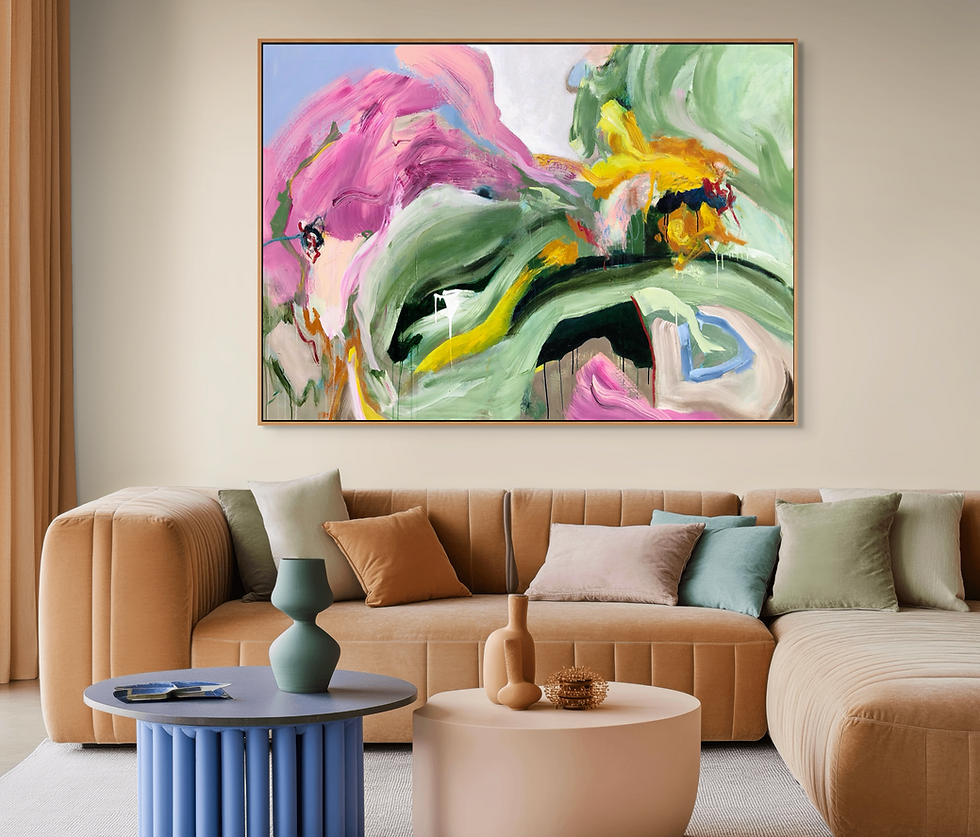
This is the caveat that matters most. A 72-inch painting on a 74-inch wall is overwhelming. The same painting on a 10-foot wall above a sofa is commanding. Scale should be proportional to the wall span and the furniture it anchors, not to the room's square footage. According to Wall Nora's sizing guide, art should cover roughly 60 to 75 percent of the furniture width below it. For an 84-inch sofa, that means a painting between 50 and 63 inches wide. For a 60-inch dining table, between 34 and 45 inches.
Art that is too small makes rooms feel unfinished and choppy. Erroring on the larger side, within those proportional limits, is almost always the stronger move.
How to Read a Room Before You Choose a Painting.
Before you start looking at paintings, spend some time reading the room. Four factors determine whether a piece of work will succeed on your wall: measurement, light source, existing palette, and hanging height.
Step 1: Measure the wall, not the room
A helpful trick for choosing your size:
Take the width of the usable wall span or the furniture piece that the painting will anchor. Your target painting width is 60-75 percent of that number. Montcarta's wall art sizing guide puts it simply: aim for roughly two-thirds of the furniture width as a reliable starting point.
Furniture width | Target art width (60–75%) |
72" sofa | 43–54" |
84" sofa | 50–63" |
96" sofa | 58–72" |
60" dining table | 36–45" |
Queen bed (60") | 36–45" |
King bed (76") | 46–57" |
Step 2: Identify the dominant light source
North-facing rooms receive cooler, indirect light throughout the day. Warmer palettes, higher-value (lighter) paintings, and earth tones perform best here because they counteract the room's natural coolness. South-facing rooms receive strong, warm light and can hold cooler, deeper, or more saturated work without feeling heavy.
Step 3: Look for palette response, not palette matching
The painting does not need to match your furniture or textiles. It needs to respond to them. Cool neutrals in the room? A warm earth-toned abstract creates contrast without conflict. A room already heavy in warm wood tones? A painting with blue-green movement introduces a sense of balance. Think of the painting as the palette generator for the room, not a color echo. This doesn’t mean you should always choose these tones, but it’s helpful to understand how these colors feel together.
Step 4: Set the hanging height before you hang anything
The visual center of the painting should be 57 to 60 inches above the floor. This is the standard used by galleries and interior designers alike, and it holds regardless of ceiling height. Apartment Therapy recommends keeping the bottom of the frame 6 to 8 inches above the top of any furniture below it to maintain visual cohesion between the painting and the piece it anchors.

Color in Small Spaces: What Works and What Fights the Room.
Color is where most buyers second-guess themselves. The fear is choosing a palette that crowds an already compact room. The reality is that the right palette does the opposite: it creates depth, warmth, or a sense of spatial recession depending on what the room needs.
2026 interior design trends are moving strongly toward warm neutrals, earthy greens, and soft blues. These are, coincidentally, the palettes that perform best in small residential spaces. They add movement and life without competing with architectural elements.
As designer Carla Aston notes, color should function as "a cohesive story, not a collection of random accents." In a small space, that means choosing a painting whose palette relates to the room's dominant tones rather than introducing three new colors that compete with everything already there.
One thing to avoid:
Heavily patterned or visually busy compositions can overwhelm compact rooms. Abstract works with clear spatial zones, a dominant color field with gestural movement layered over it, read more cleanly at a distance, and hold their presence without fragmenting the wall. House Beautiful's 2026 coverage notes that homes are moving toward "warmer, richer, more expressive palettes after years of off-white minimalism," which means gestural abstraction with layered color is particularly well-timed right now.
The Case for Committing to One Statement Piece.
Multiple small frames in a compact space increase the number of decisions the eye must make. Each frame is a visual event. In a room with limited wall real estate, that accumulation can read as clutter rather than curation. Interior designers consistently recommend reducing competing elements in small rooms rather than multiplying them.
*Don’t get me wrong, I love a gallery wall. I almost always have one wall somewhere in my home to showcase my collection of smaller pieces; however, choosing where to put it is always a challenge, as bigger pieces tend to shine better.
A large original painting does something a print wall cannot: it has physical presence.
The surface of an original work reads differently from six feet away than from two feet. Texture, layered paint, color saturation, these qualities register at a distance and give the room material depth that reproductions and smaller prints do not replicate. That presence is what makes a compact room feel considered rather than decorated.
When one statement piece anchors the wall, everything else in the room responds to it. Furniture, textiles, and lighting find their relationship to a single reference point rather than competing with one another. The room becomes easier to read and easier to live in.
For first-time buyers of original art, this is also the more practical path. One well-chosen work is a clearer decision than assembling a cohesive gallery wall. If you want a deeper look at how to approach buying original work with confidence, How to Buy and Collect Abstract Art covers the full process from budget to installation.
Large-Format Works from My Studio That Live Well in Residential Spaces.
The six works below are current large-format originals from my studio. I am describing each one not as a product, but as a painter considering where and how each piece performs in a home. Dimensions are in inches (width x height).
Abstract X (54" x 66"): A vertically oriented work with layered warm and neutral tones. The vertical proportion draws the eye upward, making it particularly effective in rooms with lower ceilings. Works well above a sofa or as a standalone bedroom anchor.
Rhapsody Blue III (65" x 46"): A horizontally oriented work in a cool blue palette. The blue-led composition creates a sense of spatial recession, making it a strong choice for narrow living rooms or tight dining spaces where the wall needs to feel farther away.
Autumn Shades I (60" x 47.5"): Warm amber, ochre, and earth tones with gestural movement. This is a bedroom painting: intimate, grounding, and well-suited to north-facing rooms that benefit from warmth.
Terrain Blue (71" x 60"): One of the larger works in the studio, with a blue-dominant palette and strong horizontal presence. Designed to anchor a substantial wall above a sofa or in an open-plan living space.
Daylight V (76" x 54"): A high-value, airy composition with layered light tones. Works in bright south-facing rooms and spaces that need presence without visual weight.
Uncovered VII (60" x 42"): A more compact large-format work with layered surface interest. Good for walls where a 70-inch painting would be too dominant, but a smaller horizontal work would feel insufficient.

Custom commissions are available for buyers who need a specific dimension or palette direction. If you are working toward a wall that does not fit a standard canvas size, that is exactly the conversation I am set up to have.
For a broader look at how abstract art fits different room types and styles, How to Choose Abstract Art for Your Home covers the full decision framework beyond small spaces.
Start with the Wall, Not the Painting.
Small rooms rarely need smaller art. They need one deliberate decision made well: the right scale, the right palette response to light, and the confidence to let a single work anchor the space rather than filling the wall with options.
Measure the wall. Read the tone. Choose a palette that responds rather than competes. Then commit to one piece that creates its place.
If you are working on a specific wall and want guidance on scale or palette before committing, I am happy to talk it through. Send a photo of the wall with its dimensions through the contact page, and I can give you a few recommendations.
If you are ready to explore available work, the six large-format originals above are a good starting point. For walls with larger ambitions, custom wall murals are also an option.
FAQ: Common Questions About Abstract Art in Small Spaces
Do I need to frame a large original painting?
Most large original canvases are gallery-wrapped, meaning the paint extends around the edges of the stretcher bars and the work hangs without a frame. This is common for abstract paintings 36 inches or wider. Framing is optional and can add weight and formality. In a small room, an unframed gallery wrap often reads cleaner against the wall.
Should I use glass over an original oil or acrylic painting?
No. Original oil and acrylic paintings should not be glazed with glass. Glass flattens the surface, eliminates the texture that gives an original its presence, and creates glare. Glass is appropriate for works on paper, watercolors, and prints, not for paintings on canvas.
How do I test a size before buying?
Cut kraft paper or newspaper to the exact dimensions of the painting you are considering and tape it to the wall. Live with it for a day. This is the most reliable way to assess the scale of your specific room before committing. Most people find they can go larger than they initially expected.
Can I hang large abstract art in a rental?
Yes. Large paintings typically require two or three wall anchors, which leave small holes that are straightforward to patch. Many renters hang works of this scale without issue. If your walls are unusually delicate or you have strict lease restrictions, adhesive picture-hanging strips rated for heavier loads are available, though they work better for lighter pieces.
How does abstract art work in a room with wallpaper or wood paneling?
Abstract art can work well on both, but palette selection becomes more important. On patterned wallpaper, choose an abstract work with a clear dominant field rather than a busy composition, so the painting reads as a focal point rather than a competing pattern. On wood paneling, cooler- or lighter-value paintings tend to visually separate from the warm tone of the wood.
Is original abstract art worth it over prints in a small space?
From a purely visual standpoint, yes. The surface of an original painting, its texture, layering, and the way light moves across it, register at the distances you actually view art in a small room. A print reproduces the image but not the physical presence. In a compact space where one piece has to do significant visual work, that material difference matters more than it would in a larger room with multiple pieces.
What information should I send when asking an artist for guidance or a commission?
A wall photo taken straight-on in natural light, the wall width and height in inches, the dimensions of the primary furniture piece below or near the wall, the room's orientation (which direction the main window faces), and a brief description of the dominant colors already in the room. That information is enough to give you a specific size and palette recommendation.
How do I light abstract art at night?
Picture lights mounted to the top of the frame or adjustable track lighting aimed at the painting at roughly a 30-degree angle are the two most effective options. Avoid recessed downlights directly above the painting, which create harsh shadows across textured surfaces. Warm-white bulbs (2700 to 3000 Kelvin) render paint colors more accurately than cool-white sources.
Does abstract art work in open-plan spaces where a small room flows into a larger one?
Yes, with one consideration: the painting needs to read well from the greater distance of the larger space as well as from within the smaller one. This generally favors works with strong value contrast and clear compositional structure over very subtle, low-contrast paintings that require close viewing to resolve. A painting that anchors a small dining area, for example, should hold its presence when viewed from an adjacent living room.
How do abstract art styles relate to minimalist homes?
Gestural abstraction and color field painting are particularly well-suited to minimalist interiors because they add visual energy and material depth without introducing representational subject matter that might compete with the room's restraint. Nature-inspired palettes, sage, clay, storm grey, and deep forest, work especially well because they extend the minimalist vocabulary rather than breaking from it.


Comments