Why Depth Matters More Than Detail: Value, Layering, and Texture in Abstract Acrylic and Oil Painting.
- Elisa Gomez
- Apr 21
- 9 min read
Updated: Apr 22

People often ask me what makes a painting feel substantial. Not size, not color, not even subject matter. Weight. The sense that something is happening beneath the surface, that the work has been lived in rather than applied.
My answer is always the same: depth. And depth, in abstract acrylic and oil painting, has almost nothing to do with detail.
The real source of depth in abstract art is the deliberate interplay of value contrast, layered paint, and varied texture. These three elements, working together, make a painting feel dimensional when you stand in front of it, making your eye move through it rather than across it. Strip any one of them away, and the work flattens, regardless of how skilled the mark-making is.
The contemporary art market is beginning to reflect this. Sales of contemporary abstract works rose 40% in 2026, with collectors specifically seeking hand-painted, tactile originals over prints. What they are responding to, whether they name it or not, is depth built through process. This post is about that process, and why I think it matters more than anything else in the studio.
Value Contrast: The Architecture of a Painting.
Before I mix a single color, I think about value. Not hue, not saturation. Value: the relative lightness or darkness of every area on the canvas.
Value contrast is the structural framework that guides the eye. A painting with low contrast feels soft and atmospheric, like fog settling over water. A painting with high contrast pulls the eye sharply, creating drama and focus. Most abstract paintings I find genuinely compelling use both, moving between the two across the canvas so that certain passages recede and others advance.
How I use value in the studio:
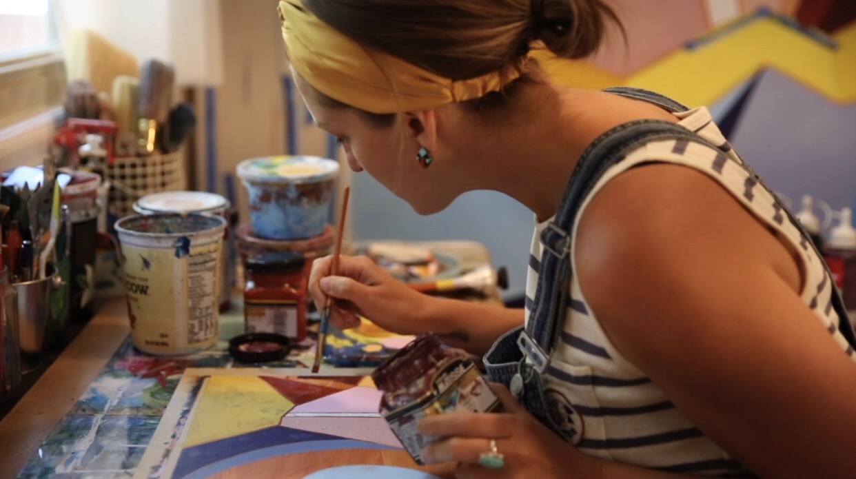
My process begins with a loose underpainting, sometimes in a diluted neutral, sometimes in a bright yellow, sometimes a soft blue. I'm not planning the final painting. I'm establishing which areas will carry the light and which will hold the dark. This decision shapes everything that follows.
The key is intentional contrast, not accidental. When a dark passage sits against a warm, pale ground, the eye reads that edge as space. It perceives distance. That perception of distance is the beginning of depth.
Bold value shifts create the illusion of space in a flat surface. Without them, even the most complex mark-making reads as decoration rather than dimension. |
Color can support value contrast beautifully. I often work with earthy, muted tones in the darker passages and reserve my most saturated, luminous colors for the lightest areas.
The result is a painting in which color and value reinforce each other rather than compete. This is something I've observed in the broader shift in abstract painting right now: artists are moving away from flat, restrained neutrals toward bold value contrasts that pair earthy palettes with jewel tones and metallics, creating work with genuine emotional depth.

Layering: Building a Painting Rather Than Painting a Surface.
The most common mistake I see in abstract work, including my own earlier work, is treating the canvas as a surface to be covered rather than a structure to be built. Intentional layering changes that relationship entirely. I use mistakes softly; if the intention is to simplify flatness, then this will get the job done.
Acrylic paint dries fast, which is often treated as a limitation. I treat it as a gift. Within an hour, I can have several distinct layers on a canvas, each one interacting with what came before. Some layers are transparent washes that tint without obscuring. Others are opaque passages that block out and redirect. The painting becomes a record of decisions made over time, and that record is part of what gives it presence.
Conversely, oil paint dries much more slowly and requires me to consider my choices and look at my layers for longer. Both paints have the same effect: a record of time and materials; however, they give the depth I want to communicate.
What layering actually does to a painting.
Layering creates what I think of as visual history. When a viewer stands close to one of my larger works, they can see through the surface to earlier marks, earlier colors, and earlier moments in the painting. That transparency, even when it's subtle, communicates that the work has history. It has been through something.
The practical effects of layering are specific:
Optical color mixing - thin glazes of one color over another produce hues that can't be mixed on the palette, giving the surface a luminosity that solid paint lacks
Edge variation - earlier layers leave edges that later layers partially cover, creating soft and hard transitions across the same canvas
Tonal complexity - passages that read as a single color from across a room reveal multiple values and temperatures up close
Implied movement - layers applied in different directions leave directional marks that create energy beneath the final surface
There is a stage in every layered painting that I have come to accept as necessary: the point at which nothing is working, where the painting looks overworked or underdeveloped and confused. I used to fight through it quickly, trying to resolve the surface. Now I sit with it and learn where it needs to go. That stage is where character accumulates. The paintings I'm most proud of are the ones that went through the most difficult versions before arriving at the final one.
"Layering is one of the most powerful ways to bring a painting to life." |
For collectors, this matters in a concrete way. A painting built through genuine layering cannot be replicated by a print or a work completed in a single session. The depth you see is physical as much as visual. It is the result of time, and it holds that time inside it.

Texture Variation: How a Surface Speaks
If value contrast is the architecture and layering is the history, texture is the voice. It is what you feel before you consciously see it, the quality that makes a viewer lean in rather than pass by.
In my studio practice, texture is never uniform. A painting in which every gesture has the same surface quality, whether smooth or heavily built up, reads as monotonous, regardless of how strong the color is. Variation is what creates tension and relief, what gives the eye places to rest and places to be activated.
The tools and decisions behind texture
I work with a range of tools to build texture across a single canvas, including; palette knifes, wide bristle brushes, dry brushes, rags, and thickening mediums.
The most important decision is not which tool to use but where to concentrate the texture. I typically reserve the most built-up, impasto passages for the areas of highest value contrast, so that light catches the raised surface and amplifies the drama already present in the paint. Smooth, quieter areas surround these moments, giving them room to breathe.
Texture and the collector's experience
There is something that happens when a painting with real physical texture is hanging. As the light changes through the day, the surface changes with it. A ridge of paint that catches morning light at a low angle disappears in afternoon light and reappears differently by evening. The painting can transform throughout the day.
This responsiveness to light and environment is something collectors and interior designers increasingly seek in original works, particularly for large-scale installations where the painting must hold its own against architecture. A flat, printed surface cannot convey this. A hand-made, textured original can.
The current interest in tactile surfaces in abstract painting reflects something broader: a cultural appetite for authenticity, for objects that carry evidence of human making. As one market analyst noted, "the demand for hand-painted, authentic works is reshaping the market, as collectors seek individuality and customization in their art." Texture is the most immediate proof of that authenticity. It is a part of a painting that cannot be faked.
When the Three Work Together:
Value contrast, layering, and texture variation are not three separate techniques. In a painting that works, they operate as a single process.
The value structure determines where the eye goes. The layers give those passages complexity and history. The texture gives them physical presence. When all three align in the same area of a canvas, that area becomes the center of gravity for the entire painting. The viewer cannot look away from it, maybe even without knowing why.
This is what I mean when I say depth matters more than detail. A highly detailed painting can still feel flat if the values are compressed, the surface is uniform, and the paint was applied in a single pass. An abstract painting with almost no recognizable imagery can feel vast and inhabited if the values are bold, the layers are rich, and the surface carries real physical variation.

Depth is not a property of what a painting depicts. It is a property of how a painting is built.
If you are drawn to abstract work that carries this kind of presence, I would be glad to talk about what a commissioned painting might look like in your space. Every commission begins with a conversation about scale, palette, and the environment the work will inhabit.
Frequently Asked Questions:
What is value contrast in abstract painting?
Value contrast is the difference in lightness and darkness between areas of a painting. In abstract acrylic work, it serves as the structural framework of the composition, directing the eye's path and creating the illusion of space on a flat surface. High-contrast areas advance toward the viewer; low-contrast areas recede. Without deliberate value contrast, even technically complex mark-making reads as flat decoration rather than dimensional space.
How does layering create depth in acrylic painting?
Layering builds depth by creating a visual record of decisions made over time. Each layer of acrylic paint interacts with the one beneath it, producing optical color mixing, edge variation, and tonal complexity that cannot be achieved in a single application. Transparent glazes allow earlier marks to show through, giving the surface a sense of history and dimension. The result is a painting that reveals more the closer you stand to it.
What is the difference between texture and detail in abstract art?
Detail refers to the precision or complexity of imagery within a painting. Texture refers to the physical and visual quality of the paint surface itself. A painting can be highly detailed and still feel flat if the surface is uniform. Conversely, an abstract work with minimal imagery can feel deeply dimensional if it carries varied texture built through palette knives, brushwork, and layered mediums. Depth comes from texture and value, not from detail.
Why do abstract acrylic paintings feel different from prints?
Original abstract acrylic paintings have physical texture that printed reproductions cannot replicate. Raised ridges of paint catch and shift with natural light throughout the day, meaning the surface reads differently in morning light than in evening light. This responsiveness to the environment is a quality unique to hand-built, layered originals. It is also why collectors and interior designers increasingly specify original works for significant spaces rather than high-quality prints.
What is the impasto technique, and how does it affect depth?
Impasto is the application of paint in thick, raised passages that create physical dimension on the canvas surface. In abstract acrylic painting, impasto passages are most effective when placed at points of high value contrast, where raised texture catches light and amplifies the drama already present in the paint. Surrounding areas of smooth or lightly textured paint give impasto passages room to read clearly, creating a push-and-pull between surface weight and openness.
What tools do abstract painters use to create texture variation?
Common tools for building texture variation in abstract acrylic painting include palette knives for sharp ridges and flat planes, wide bristle brushes for directional drag marks, dry brushing to highlight raised edges from earlier layers, modeling paste or gel mediums for dimensional buildup, and soft cloths or rags to blend and erase passages back into the ground. The key is not which tools are used but where texture is concentrated, typically at the focal points of highest value contrast.
How do collectors identify quality in abstract acrylic paintings?
Quality in abstract acrylic painting is evident in the interplay among value contrast, layering, and texture. A well-built painting rewards close looking: passages that read as a single color from across a room reveal multiple values and temperatures up close. The surface exhibits physical variation that shifts with changes in light. Earlier layers are visible beneath later ones, communicating that the work has been built over time rather than applied in a single session. These qualities cannot be faked or printed.
What is the "ugly stage" in abstract painting, and why does it matter?
The ugly stage is the point in a layered painting where the work looks overworked, confused, and unresolved. It typically occurs in the middle of the layering process, when enough marks have accumulated to create visual noise but not yet enough decisions have been made to resolve the composition. Experienced painters recognize this stage as necessary rather than a sign of failure. The character and depth that distinguish a finished painting from a superficial one accumulate precisely during this difficult period.
How does value contrast interact with color in abstract painting?
Value and color are distinct properties, but they work most powerfully when they reinforce each other. In abstract acrylic painting, muted, earthy tones in darker passages and saturated, luminous colors in lighter areas create a composition where value and color pull in the same direction rather than competing. This approach, increasingly common in contemporary abstract work, produces paintings with strong structural clarity and genuine emotional depth, as the eye reads both the light-dark architecture and the color temperature simultaneously.
How long does it take to build a layered abstract acrylic painting?
A genuinely layered abstract acrylic painting cannot be completed in a single session. Because each layer must dry before the next is applied, the process unfolds over multiple working days, sometimes weeks for larger or more complex compositions. Acrylic paint's fast-drying time makes it more manageable than oil, but the time investment is real and deliberate. For collectors, this is relevant: the depth visible in a finished work is a direct record of that accumulated time, and it holds that time inside it.


Comments